· Tips · 2 min read
Common Mistakes to Avoid When Creating App Store Screenshots
Create impactful app screenshots by using multiple images, high-quality formats, descriptive captions, localized language, and showcasing achievements to attract and retain users.
Overview
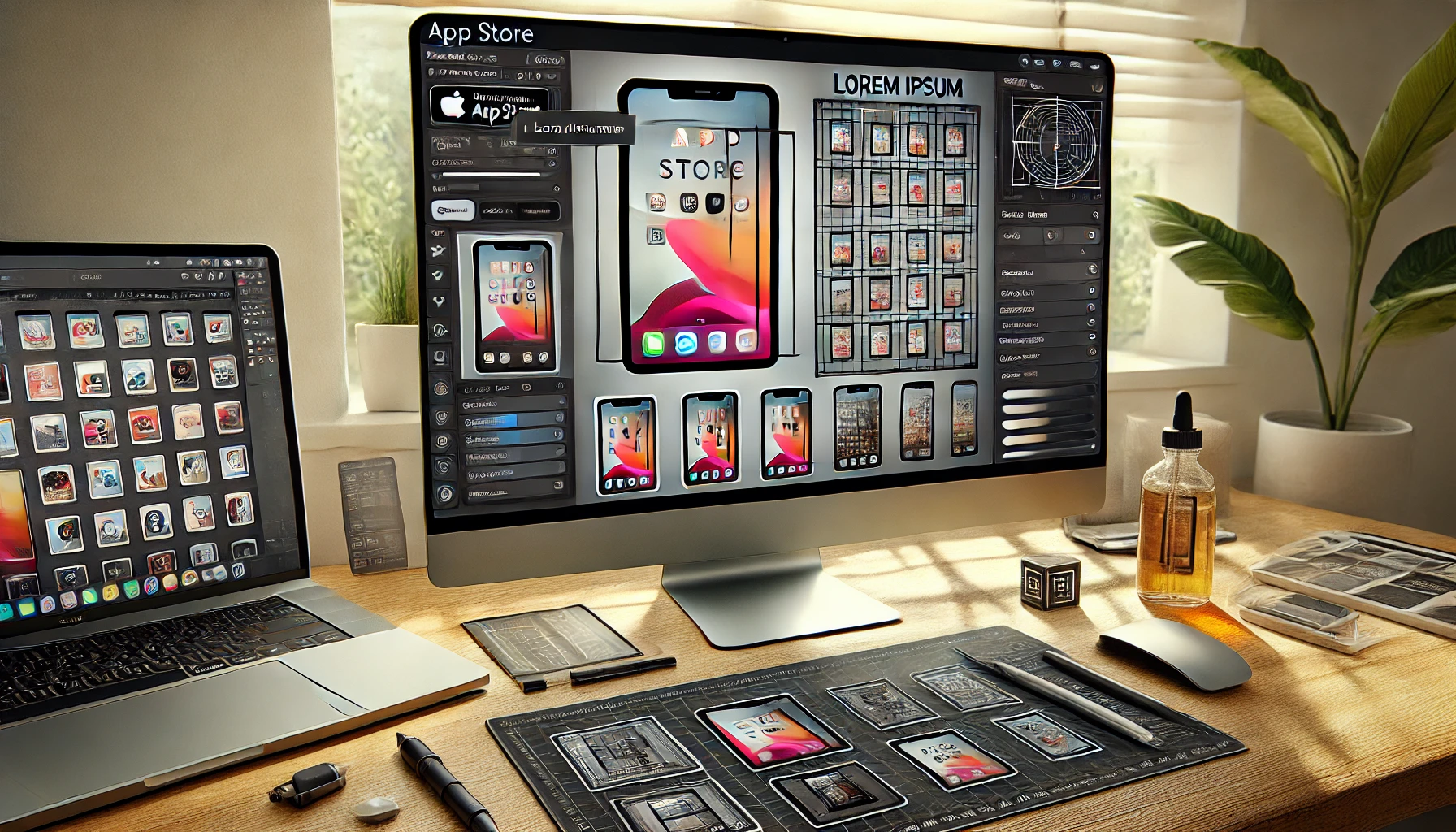
Creating professional and appealing app store screenshots is crucial for attracting potential users and improving your app’s download rate. However, there are common mistakes developers make that can detract from the effectiveness of these screenshots. Here’s a guide on what to avoid:
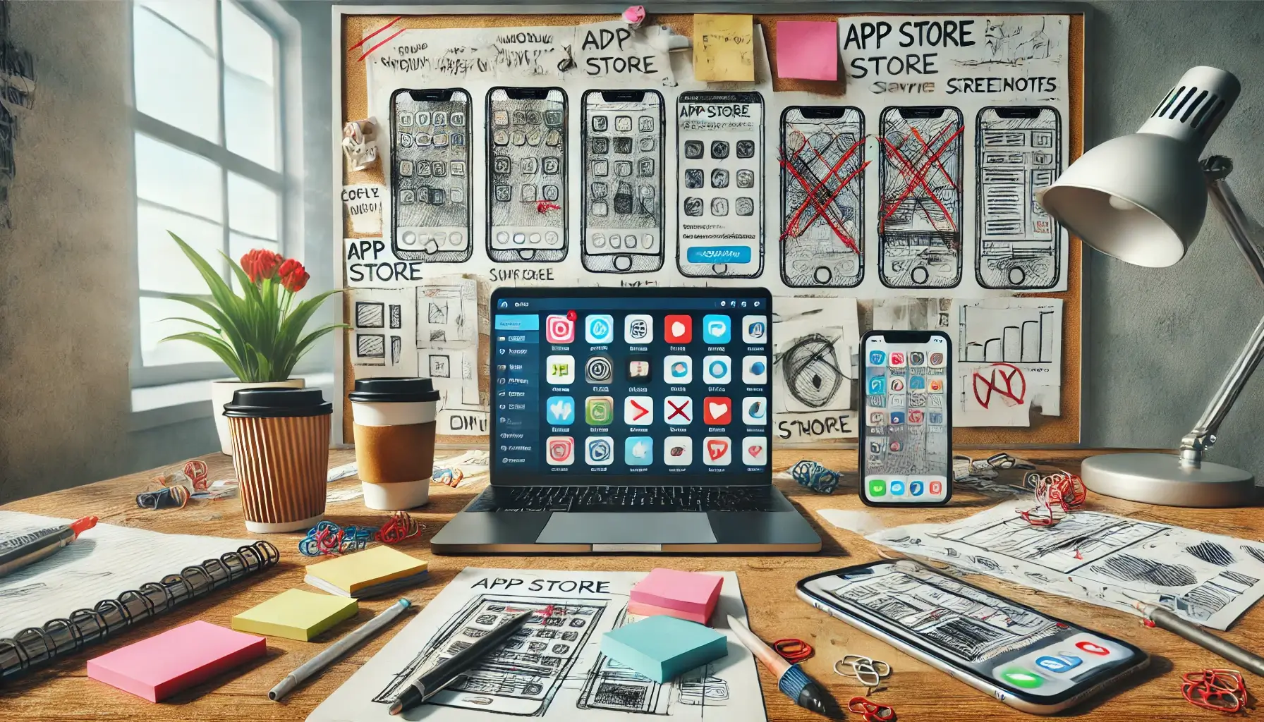
1. Cluttered Design
Overloading your screenshots with too much information can overwhelm viewers. Instead, focus on key features and keep the design clean and straightforward.
Tip: Use minimal text and highlight only the most critical aspects of your app.
2. Low-Quality Images
Using low-resolution or pixelated images can make your app look unprofessional. High-quality images are essential to convey the professionalism and quality of your app.
Tip: Always use high-resolution images and ensure they are crisp and clear.
3. Ignoring Branding Consistency
Inconsistent branding across screenshots can confuse users and make your app seem disjointed. Ensure your brand’s colors, fonts, and overall style are consistent.
Tip: Develop a style guide and stick to it for all your screenshots.
4. Overlooking Context
Screenshots that don’t clearly show how the app is used can be confusing. Always provide context so users understand what they’re seeing.
Tip: Include device frames or real-world backgrounds to show the app in use.
5. Neglecting Localization
If your app is available in multiple regions, failing to localize screenshots can alienate potential users. Localized screenshots can make a significant difference in user engagement.
Tip: Translate text and adapt visuals to fit the cultural context of each market.
6. Ignoring App Store Guidelines
Each app store has specific guidelines for screenshots. Ignoring these can result in your screenshots being rejected or not displayed correctly.
Tip: Review and adhere to the guidelines of the app store you are targeting.
7. Lack of User-Focused Content
Screenshots that only highlight features without showing the user benefits can be unappealing. Focus on what the user can achieve with your app.
Tip: Showcase the app’s benefits and how it improves the user’s life.
Conclusion
Avoiding these common mistakes can significantly enhance the quality of your app store screenshots, making them more attractive to potential users. A professional and polished set of screenshots can be the difference between a user choosing your app or moving on to another. Utilize tools like App Store Shot to streamline the creation process and ensure your screenshots are top-notch.
By addressing these common pitfalls, you can create compelling screenshots that not only look great but also effectively communicate the value of your app to potential users.